Wednesday 17 April 2013

Q7-Looking back at your preliminary task, what
do you feel you have learnt in the progression from it to the full product?
I know that I have come a long way from my preliminary task because I see the difference from then and now. With my first project I didn’t do much research and I didn’t know how to you Photoshop properly. I now know that research is important, I wanted my final magazine to look real so I had to do a lot of research into magazines and what they use. Looking at my preliminary task I feel embarrassed as to how rubbish was and impressed to how far I have come, I think that is an important part in an evaluation and looking back on the old task. It would be pointless if I produced such poor work for my final, it would me than I have not learn nothing new and I haven’t progressed throughout the last couple of months. I didn’t pay much attention to fonts and colours when producing my prelim task. The font I used does not look real and the colours I used do not blend together. I didn’t 
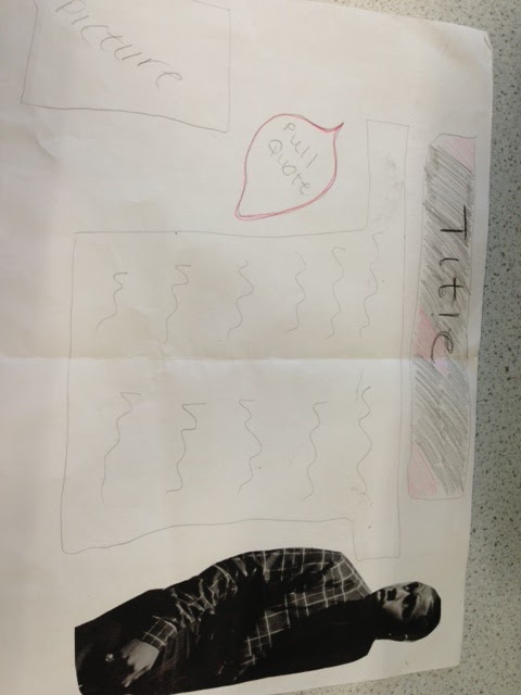
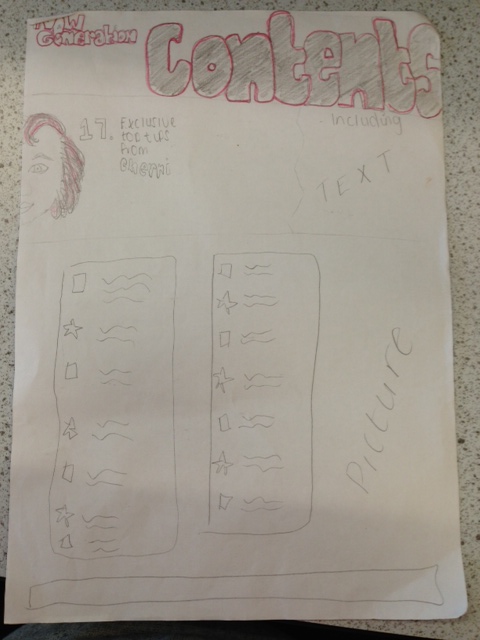
pay attention to the text on the front cover. There was not enough text. This 
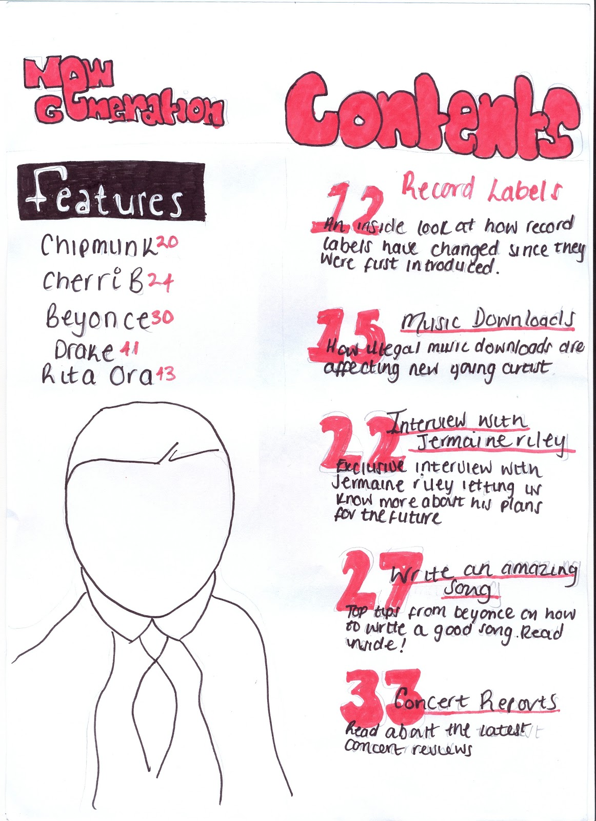
was also a problem on the contents page, I didn’t have enough pages on it and the set out was really poor. This also was due to the lack of research on other magazines.


Q5. How did you attract/address your audience?
I attracted/addressed my audience by doing different types of research before creating my magazine, making sure that I have taken all their needs into consideration. I did questionnaires and an interview with a group of students between the age of 18 -20. I showed them two R&B magazines and I asked them to discuss which magazine they preferred and disliked and why. Here is the video to recap on.

 Q4. Who would be the audience for your media product?
Throughout the whole of my magazine I made sure that with everything I do, I make sure that it represents my audience which is the youth. On the front cover the colours I use is red and black. These colours stand out. In a pop magazine it usually has bright colours to attract early teens. My magazine is targeted at later teens early twenties. The colour red is bright but is not as overpowering as a magazine for younger individuals, I also stuck to the two main colours (red and black) this made it look more mature. On my contents page, the pictures that I use are people within my target audience, which

allows the reader to relate to them. Again linking to the name of my magazine ‘New Generation’ my magazine is targeted at individuals wanting to enter the music industry. This influenced the text within my magazine and the artist I chose to interview. I was careful about the questions I asked my artist. I made sure that they would be relevant to the theme of my magazine and allowed the reader to get a feel of what the music industry would be like.

Female
Name: Kamesha Wynter
Favourite Artist: Beyonce, Cherri V, Drake, Rita Ora
Interests: Singing, Writing songs and socialising.


Male
Name: Andrew Smith
Favourite Artist: Drake. RayJ, Beyonce, Chipmunk
Interests: Football. Producing music, Rapping
Question 3-What kind of media institsuation might
distribute your media product and why?

Podcast coming soon
Q1-In what ways does your media product use, develop or
challenge forms and conventions of real media products? 

My Double Page Spread


My Final Contents Page


My Final Front Cover


Making My Double Page Spread


I have now started the creation of my DPS. I am using InDesign and I don't think that I like it more than Photoshop. I have decided to use Photoshop instead. This is due to the colour of the picture. As you can see the backgroud of the picture does not match the colour of the page so it looks off-coloured, which makes it not look professional.
Making my Contents Page


I have started to produce my magazine and I decided to use a three column set out which I copied from the magazine on the right. I need to chose a different font as this font is not looking good.

Tuesday 16 April 2013

Tuesday 26 February 2013

Using photoshop to produce my front cover

I'm currently working on my front cover. Choosing the right title was difficult but with advise from others I think I know which one I am going to use.
 
Sneak-Peak of the pictures from my photoshoot


The photshoot went really well and I was able to get a wide range of picures with my artist wearing different clothing. This made it easy for me to choose the perfect picture for my front cover and double page spread. 

Monday 11 February 2013

Interview video coming soon!

I have finally done the photoshoot with my artist and finished the interview. I am in the middle of editing the video, once i have finished that I will upload it straight away. Keep posted!

Tuesday 5 February 2013

My Brother who goes by the name of Mayday is a music producer who has worked with many people. He has made music for people like Cheryl Cole and Jamelia. He has also appeared on different music channel adverts (picture on the right). He has worked very closely with all of the members of FDM and he was able to let me get in contact with Varren and Jermaine. 


Varren Wade
(My choosen artist)
 
 
This is one of Varren Wade's songs that he wrote and sang.


Finding a artist to Interview


Varren Wade and Jermaine Riley are both from the boy band called FDM. My Plan was to use Jermaine Riley as my artist but he wasn't able to come for the date I needed him. I was able to get intouch with Varren and he is able to come to my college to take pictures and have an interview on Friday 8th Feb. It wasn't too hard to get intouch with them as my older brother is a music producer and works with these singers.
Research- Finding a artist 


This is a UK R&B group called FDM. They spent some time in America and was signed to Neyo's label. They spit up over the years and are now going solo.
Improved Flat Plan- DPS


Improved Flat Plan- Contents Page


Improved Flat Plan- Front Cover


Peer Assessment


In lesson we had to do a peer assessment. This mean't that we had to look at someone's flatplans and say what you like and do not like. From what was said about my flatplans I know that I have many things to change. It was said that the picture on my front page is too small and needs to be bigger. It was also said that I do not have enough writing on the front cover and content page. I think doing this peer assessment was a good idea as i am now able to improve my flatplans before I start the real front cover, contents page and DPS.

Flat Plan DPS (Draft)

Flat Plan Content Page (Draft)


Flat Plan Front Cover (Draft)


Monday 28 January 2013

Evaluation of Qualitative and Quantitative Research
By doing the Qualitative and Quantitative research I learn't a lot about everyone's preferences. When doing the focus group I learn't that colours are what attract most people, so I will need to have a good colour scheme on my page. One of the complaints on the video was that the number pages and images on the contents page looked confusing making the reader have to search hard, which they do not want to do when buying a magazine. I also learn't that having a famous person as the imagine attracts the reader first. another complaint was that the image on the content page was not showing the artist face properly so I now know that when I take pictures the artist face needs to be clear.

Tuesday 8 January 2013

Tuesday 1 January 2013

Reggae is one of the genres that I'm considering to base my magazine on. This is an example of a reggae based magazine. The title logo links to the colours relating to reggae.